This post talks about a mini analytical dashboard which was done during our time in TactLabs for Featurepreneur
The word in the title probably might have you thinking I made a grammatical error there but hear me out, it isn’t.
Smalltics stands for Small Analytics and it is a feature developed with my good friend Kamal during our part-time work for TactLabs.
What am I talking about??

Smalltics — What is it?
We had a set of requirements set forth by an anonymous investor who wanted to see a dashboard based on the data that is fed to it.
- Upload the CSV
- Choose the X and Y axes
- Choose the type of plot
The Application
This was built using the following modules:
Flask — Base of the web app Plotly — For the visualizations Gunicorn — The web server when deploying to Heroku
Let’s get into how the website works:
When you head to the home page you are met with this screen:
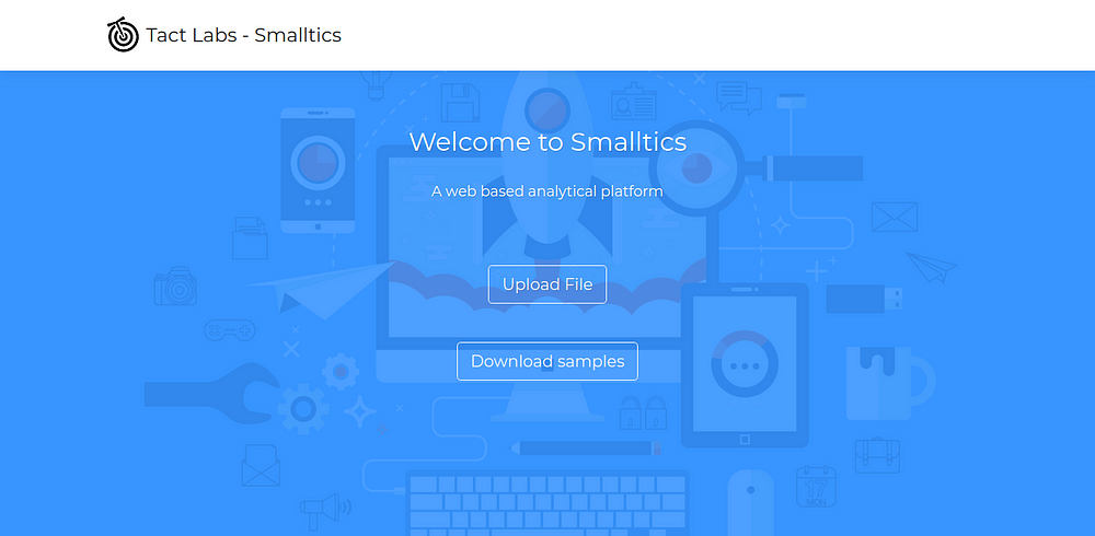 Home Page of Smalltics
Here you can test it out with your own dataset or try out some of the samples present. They are:
New Zealand Migration Dataset
Car Details Dataset
Wine Details Dataset
Cab Dataset
Electrical Consumption Dataset
In the next few versions, we are planning to remove the links and keep it in storage to be retrieved easily and save the hassle of downloading the CSV.
Alright, once that is done you hit Upload File.
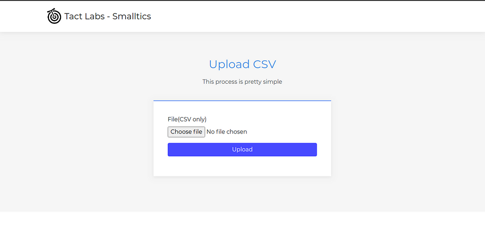 The place to upload CSV
On this page, you only have to upload the CSV and we can ready up the plot for you based on the X and Y axes.
After uploading the CSV, it brings us to our next page. I will be using the New Zealand Migration Dataset for this example.
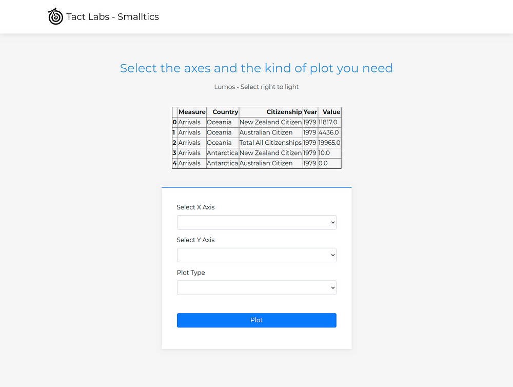 Choose X, Y, and Plot and you’re good
On this screen, you can see the first few rows of the data just to know which columns to take for X and Y axes.
You can choose one of the few plots currently:
- Scatter Plot
- Line Plot
- Bar Plot
- Sunburst Plot
- Correlation Matrix
- Table
More plot styles are still looked into and will be updated soon.
Here are a few plot styles that are possible from the NZ Migration Dataset:
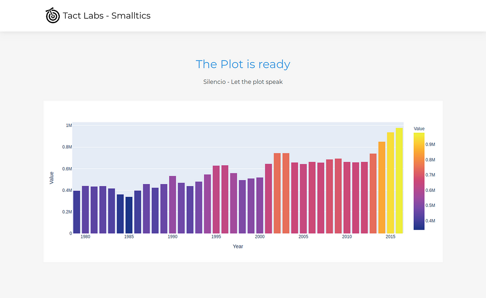 Bar Plot with Year and Value
In this plot example:
- X-axis — Year
- Y-axis — Value
Another visual that can be drawn from here can be:
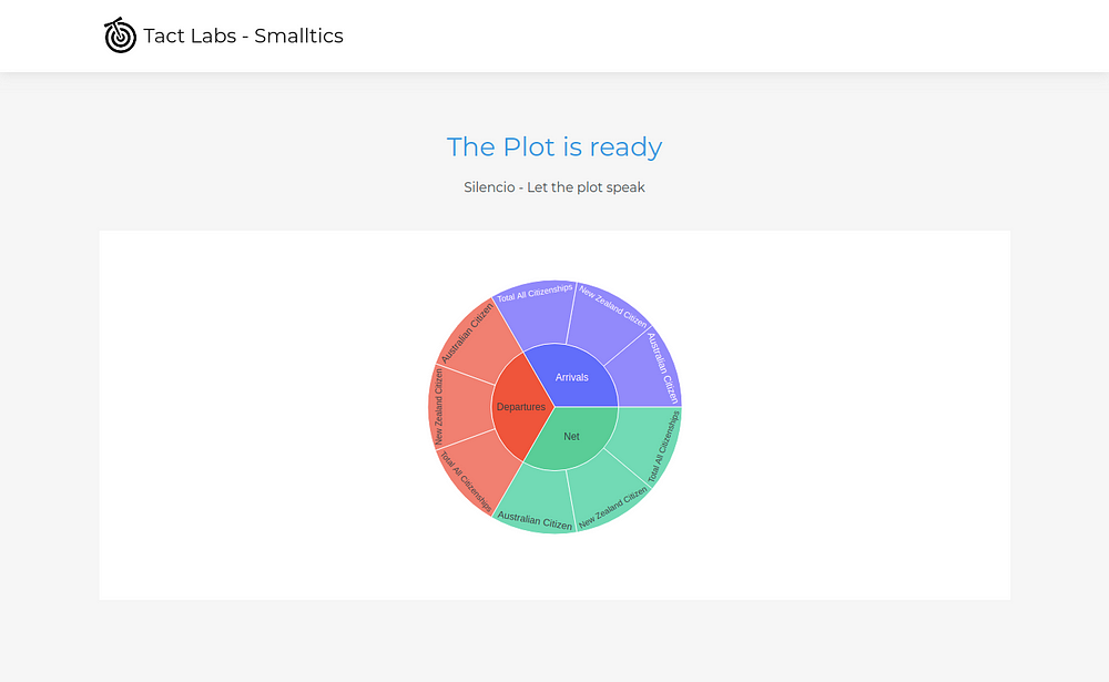
Sunburst Plot with Measure and Citizenship
This is a Sunburst plot with:
- X-axis — Measure
- Y-axis — Citizenship These are some of the examples that can be plotted with the given dataset. It's all about finding the right plot for the right columns.
Since Plotly is interactive and easy to write, it makes for a good look and feel in the dashboard. Also, we can download the plots for use later as well.
Featurepreneur and Us
This was developed as a feature for Featurepreneur for our boss Raja CSP Raman with Kamal. The anonymous investor was pleased and we were awarded Half a million TactCoins (20,000 INR)
 Featurepreneur Articles