
By the name itself, we can guess it is related to Stack overflow. This is one of the interesting features.
Requirements 📃
The requirement of this feature as we have to run a query in stack exchange in order to collect data from stack overflow. The basic idea of this feature is to collect the number of questions asked in each technology, programming language from stack overflow. The data has to be collected from the year 2009 to 2019 for each month.
Why we choose this feature? 😇
These requirements sound really interesting. I liked the idea of collecting those data. From those data, we can have a lot of visualizations and we can predict which is going to be popular technology in the upcoming year.
My Team ⛳️
My team is small, me and my friend Aishwarya Ramaswami are part of this feature. This feature helped me to learn and share our knowledge with each other. It was a great start for knowledge transfer. We were able to come up with many visualization and conclusions that can be drawn from those data. It was really interesting to collect those data.
Tech Stack 💻
In order to run the query in the stack exchange, we have to write queries to collect the posted question for each year. We used Jupyter Notebook. The output is got from Stack Exchange, stored in google sheets.
Working Hours ⏰
This process of collecting data takes a lot of time, so we took around 40 hrs for collecting 100 tech keys with a count of questions each year. These data are collected for each month of the year since it gives a clear view for visualization and analysis.
Phases This feature had 2 phases, for the first phase we have to collect for 50 tech keys, and for the next 50 tech key collection was the next phase.
Tact Coins 💰
The tact coins given for this feature were 20 CAD. We shared among us. I felt really happy after we got to venture interesting technology names. It created curiosity among us, which technology is going to shoot up in upcoming years. Data Visualization 📊 I have done some data visualization from the data which I have collected.
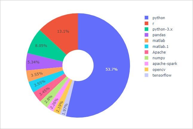
Donut Chart 🍩
The first one is the top ten keys in which a lot of questions were asked in those 10 years.
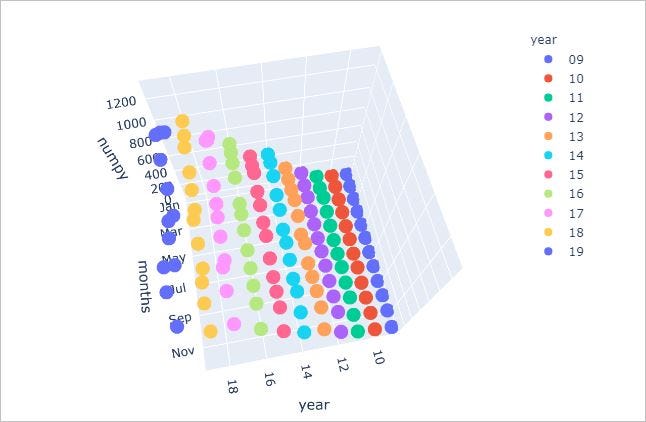
3D Chart Visualisation 💭 Here for the tech key numpy, how many questions were asked in each month of each year.
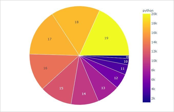
Sunburst plot 🌞
The sunburst is a plot for python. It shows the relation between the count of questions in that year. (2009–2019)
We have got interesting conclusions from the data we have collected. This was one of the best features which I worked on.
Thanks for reading this article. 😃
Hope to see you in the community!!